Flexbox
📌 Flexbox
: 자식 요소에는 아무것도 적지 않고, 부모 요소에만 적는다.
📌 부모에 ' display : flex; '를 명시.
부모가 자식을 조정할 수 있음.
📌 justify-content
: 배치할 위치 설정.
<!DOCTYPE html>
<html>
    <head>
        <title>HTML 기본 형식</title>
        <link href="styles.css" rel="stylesheet"/>
        <style>
            html {
                background-color: blanchedalmond;
            }
            body {
                margin: 20px;
                display: flex;
                justify-content: center;
            }
            div {
                height: 200px;
                width: 200px;
                background-color: darkgray;
            }
            #first {
                background-color: darksalmon;
            }
            #second {
                background-color: darkcyan;
            }
            #third {
                background-color: darkgreen;
            }
        </style>
    </head>
    <body>
        <div id="first"></div>
        <div id="second"></div>
        <div id="third"></div>
    </body>
</html>
+ 추가 설명
① 'div'의 부모 요소인 'body'에 'diplay: flex;'가 명시되어 있으므로, 'div'는 부모 요소인 'body'에 따라 설정된다.
② 'body'의 'justify-content: center;'로 인해, 'div'는 주축(수평. 변경 가능.) 기준으로 중앙에 위치하게 된다.
* justify-content는 주축(수평. 변경 가능.)에 적용되는 속성.
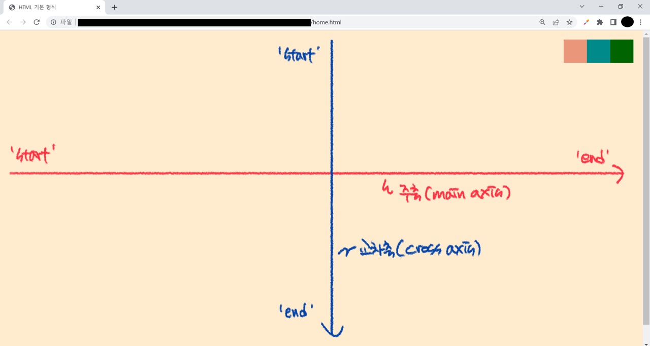
Flexbox - main axis, cross axis
📌 main axis
: 주축.
default = 수평.
📌 cross axis
: 교차축.
default = 수직.
📌 justify-content
: 주축에 적용되는 속성.
default로 수평으로 설정되어 있음.
📌 align-items
: 교차축에 적용되는 속성.
default로 수직으로 설정되어 있음.
📌 vh(viewport height)
: 화면 높이를 의미.
예) height: 100vh; → 화면 높이의 100%를 의미.
<!DOCTYPE html>
<html>
    <head>
        <title>HTML 기본 형식</title>
        <link href="styles.css" rel="stylesheet"/>
        <style>
            html {
                background-color: blanchedalmond;
            }
            body {
                height: 100vh;
                margin: 20px;
                display: flex;
                justify-content: flex-end;
                align-items: flex-start;
            }
            div {
                height: 50px;
                width: 50px;
                background-color: darkgray;
            }
            #first {
                background-color: darksalmon;
            }
            #second {
                background-color: darkcyan;
            }
            #third {
                background-color: darkgreen;
            }
        </style>
    </head>
    <body>
        <div id="first"></div>
        <div id="second"></div>
        <div id="third"></div>
    </body>
</html>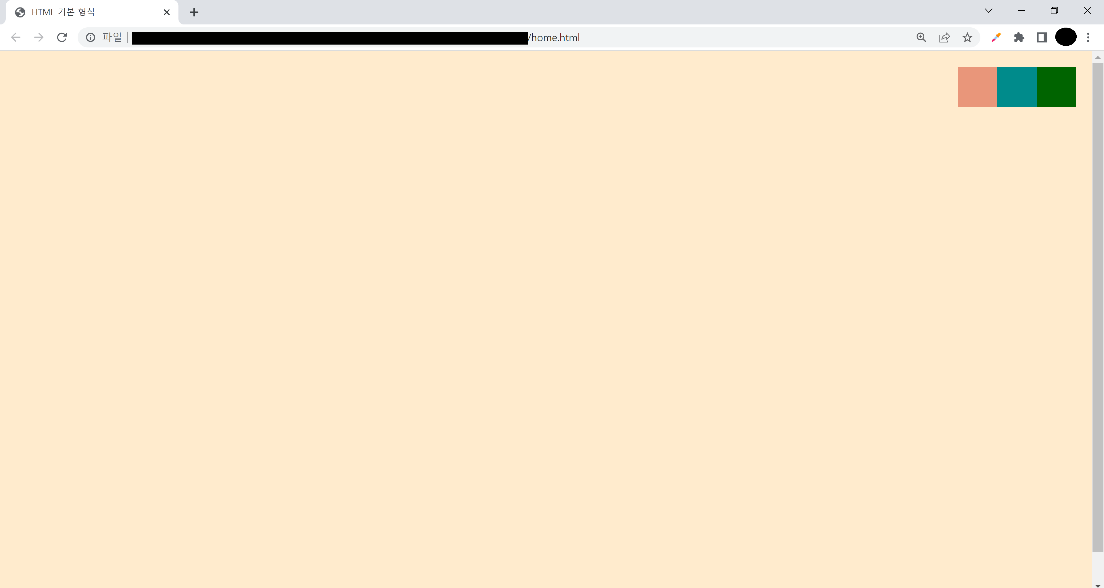
+ 추가 설명
① 'div'의 부모 요소인 'body'에 'diplay: flex;'가 명시되어 있으므로, 'div'는 부모 요소인 'body'에 따라 설정된다.
② 'body'의 'justify-content: flex-end;'로 인해, 'div'는 주축(수평. 변경 가능.) 기준으로 end(오른쪽)에 위치하게 된다.
* justify-content는 주축(수평. 변경 가능.)에 적용되는 속성.
③ 'body'의 'align-items: flex-start;'로 인해, 'div'는 교차축(수직. 변경 가능.) 기준으로 start(위)에 위치하게 된다.
* align-items는 교차축(수직. 변경 가능.)에 적용되는 속성.
④ 따라서 'div'는 오른쪽 위에 위치하게 된다.
Flexbox - flex-direction
📌 flex-direction
: 축 변경
① column ② row ③ column-reverse ④ row-reverse
💡 주축(main axis) : 빨간색, 교차축(cross axis) : 파란색

<!DOCTYPE html>
<html>
    <head>
        <title>HTML 기본 형식</title>
        <link href="styles.css" rel="stylesheet"/>
        <style>
            html {
                background-color: blanchedalmond;
            }
            body {
                height: 100vh;
                margin: 20px;
                display: flex;
                justify-content: flex-end;
                align-items: flex-start;
                flex-direction: column;
            }
            div {
                height: 50px;
                width: 50px;
                background-color: darkgray;
            }
            #first {
                background-color: darksalmon;
            }
            #second {
                background-color: darkcyan;
            }
            #third {
                background-color: darkgreen;
            }
        </style>
    </head>
    <body>
        <div id="first"></div>
        <div id="second"></div>
        <div id="third"></div>
    </body>
</html>
+ 추가 설명

① 'div'의 부모 요소인 'body'에 'diplay: flex;'가 명시되어 있으므로, 'div'는 부모 요소인 'body'에 따라 설정된다.
② 'body'의 'flex-direction: column;'로 인해, 축이 변경된다.
③ 변경된 축과 'body'의 'justify-content: flex-end;'로 인해, 'div'는 주축(수직. 위에서 아래.) 기준으로 end(아래)에 위치하게 된다.
* justify-content는 주축에 적용되는 속성.
④ 변경된 축과 'body'의 'align-items: flex-start;'로 인해, 'div'는 교차축(수평.왼오.) 기준으로 start(왼쪽)에 위치하게 된다.
* align-items는 교차축에 적용되는 속성.
⑤ 따라서 'div'는 왼쪽 아래에 위치하게 된다.
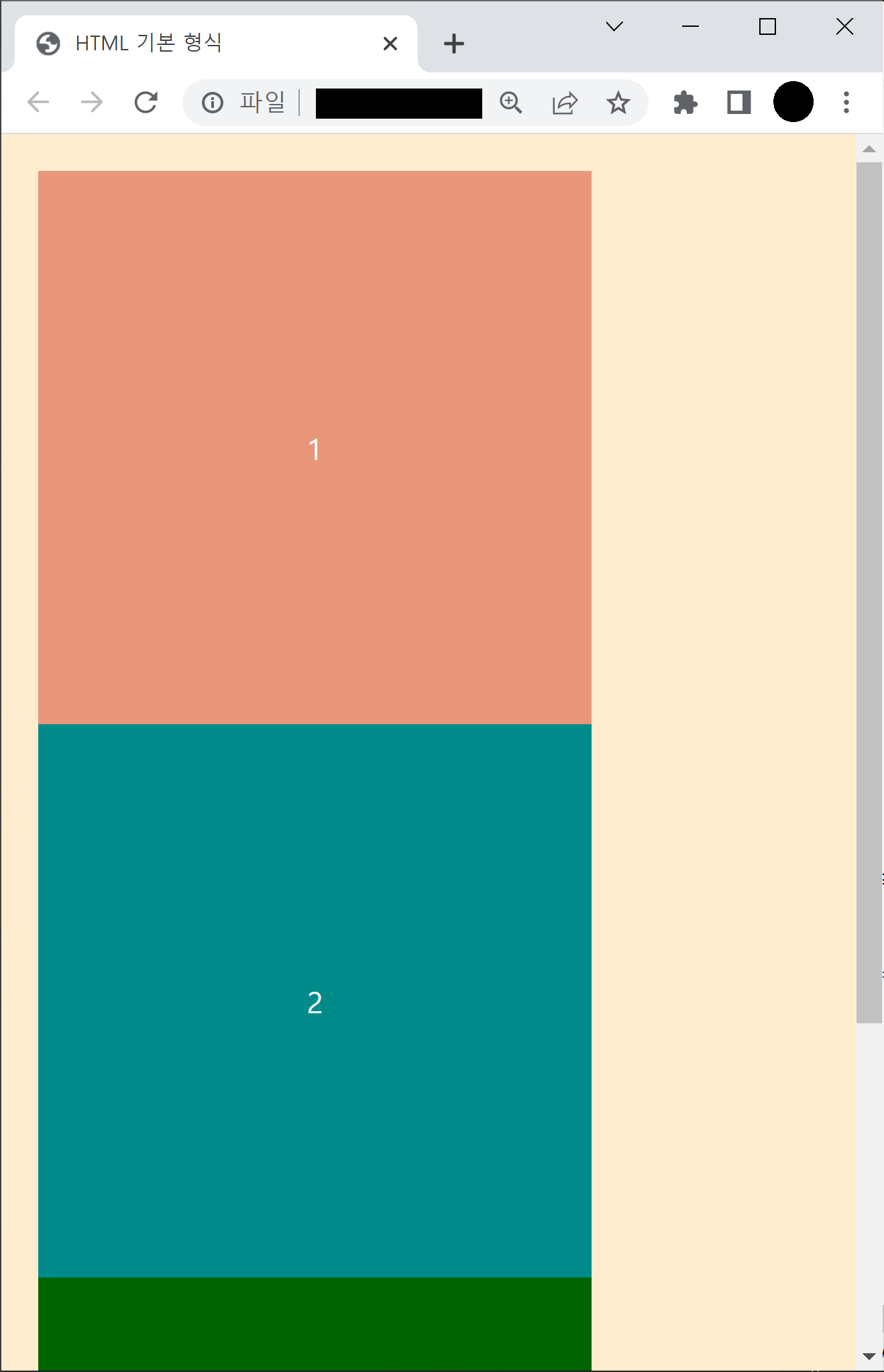
Flexbox
📌 한 flex 컨테이너 안의 자식이 flex 컨테이너가 될 수 있음.
📌 flexbox는 width를 초기 사이즈로만 사용하고, 모든 요소를 한 줄에 위치하도록 하기 위해 width를 바꿀 수 있음.
📌 flex-wrap: wrap;
: 지정된 사이즈로 명시.
한 줄에 들어가지 않으면 다음 줄로 이동.
<!DOCTYPE html>
<html>
    <head>
        <title>HTML 기본 형식</title>
        <link href="styles.css" rel="stylesheet"/>
        <style>
            html {
                background-color: blanchedalmond;
            }
            body {
                height: 100vh;
                margin: 20px;
                display: flex;
                justify-content: space-between;
                align-items: center;
                flex-wrap: wrap;
            }
            div {
                height: 300px;
                width: 300px;
                background-color: darkgray;
                color: white;
                display: flex;
                justify-content: center;
                align-items: center;
            }
            #first {
                background-color: darksalmon;
            }
            #second {
                background-color: darkcyan;
            }
            #third {
                background-color: darkgreen;
            }
        </style>
    </head>
    <body>
        <div id="first">1</div>
        <div id="second">2</div>
        <div id="third">3</div>
    </body>
</html>
'CSS' 카테고리의 다른 글
| [CSS] Pseudo Selectors (0) | 2022.09.14 |
|---|---|
| [CSS] position (0) | 2022.09.14 |
| [CSS] block | inline | inline-block (0) | 2022.09.14 |
| [CSS] class (0) | 2022.09.13 |
| [CSS] box - margin, border, padding (2) | 2022.09.13 |


댓글